Create a Bullet Graph
Excel 2013
The idea for Bullet Graphs was developed by Stephen Frew and detailed in a design specification. (PDF)
Bullet graphs display a single measure compared to a related measure, against a background of quantitative ranges that show the measures qualitative state.
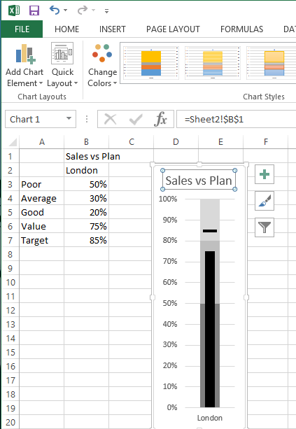
A picture being worth a thousand words, here is the Bullet Graph that this article shows how to build.
The source data
We are going to create a Bullet Graph showing Sales vs. Plan with a “Poor, Average and Good” background based on the following five figures.
| - | Sales vs Plan |
|---|---|
| - | London |
| Poor | 50% |
| Average | 30% |
| Good | 20% |
| Value | 75% |
| Target | 85% |
Creating the graph
Highlight the data range, excluding the “Sales vs Plan” heading. On the Ribbon select the Insert menu tab then click on the Graph and Stacked column Graph icons.
Click on the chart to select it. An additional Chart Tools menu with two tabs will be displayed.
Select the Design tab and click on the Switch Row/Column button.
Formatting the Target
On the graph, click on the Target series. In this example it is the biggest bar at the top of the chart.
Then on the Design menu click on the Change Chart Type button.
Change the chart type only for the Target series to Line with markers and tick the Secondary Axis box for it.
With the Target series still active, select the Format tab and click on the Format Selection button.
A new window will be displayed.
Click on the Fill and Line icon and then the Marker icon.
Expand Marker Options and set the marker to Built-in and choose the line type with a size of 15.
Expand Fill and choose Solid fill with the colour set to black.
Expand Border and choose No line.
Click on the Line icon and choose No line.
Select the Secondary axis and press the delete key to remove it.
Excel will apply the visible axis scaling to both axes.
Formatting the Value
Click on the Value series.
In the Format Data Series window, click on the Series Options icon.
Click on the Secondary Axis option and set the Gap Width to 400%.
Click on the Fill and Line icon and then expand Fill and choose Solid fill with the colour set to black.
Formatting the quantitative ranges
In the Format Data Series window, use the Series Options drop-down to select Series “Poor”.
Click on the Fill and Line icon and then expand Fill and choose Solid fill with the colour set to a dark grey.
Repeat the last two steps for the Series “Average” and Series “Poor” data series, setting each one to a lighter grey colour than the previous grey.
In the Format Data Series window, use the Series Options drop-down to select Vertical (Value) Axis.
Click on the Axis Options icon and expand the Axis Options section.
Set the maximum value to 1.
Resizing the Graph
In the Format Data Series window, use the Series Options drop-down to select Chart Area.
Click on the Size and Properties icon and expand the Size section.
Set the Height to 10 cm and the Width to 3.5 cm.
The key objective in setting the size is to ensure that the Target bar is slightly wider than the Value column. This is so that when the**Value** exceeds the Target, the Target is still visible.
Adding a Graph title
With the graph selected click on the Design menu tab, click on the Add Chart Element button and select Chart Title and Above Chart.
Then click in the Formula Bar , type = and click on the cell containing the heading text for the graph then press the Enter key.
This links the Chart Title to the value in the cell. Any changes to the cell value will automatically change the Chart Title.
Adding Additional data
If you need to expand the graph with additional data, enter the data in the column next to your source data.
Click on the edge of the graph to select it.
The current data source will be highlighted. Look for light blue border and use the drag handle to drag the border to surround the addition data.
The graph will automatically be updated with the additional data.
Thoughts
Most users need to have the graph explained to them the first time that they see it but understand it very quickly. There is a temptation to format the Poor, Average, Good using colours Red, Yellow and Green. This detracts making the graph noisy and more difficult to read.
In previous versions of Excel it has sometimes been fiddly to select specific portions of a graph in order to apply formatting. Using the Format window in Excel 2013 makes selection far easier.
To display the Format window, click on the graph, the Chart Tools menu is displayed. Click on the Format tab and press the Format Selection button. Use the drop-down menu at the top of the window to select most elements of the graph.


